pumpkin caramel swirl scones

Dear friends,

Hungry yet?   While I don't have a caramel swirl scone recipe for you today, I do have a really fabulous font to share, which might be just as satisfying, depending on the strength of your sweet tooth!  For me, there's nothing like a beautiful typeface or a baked good to brighten my day, so here's a little bit of both.

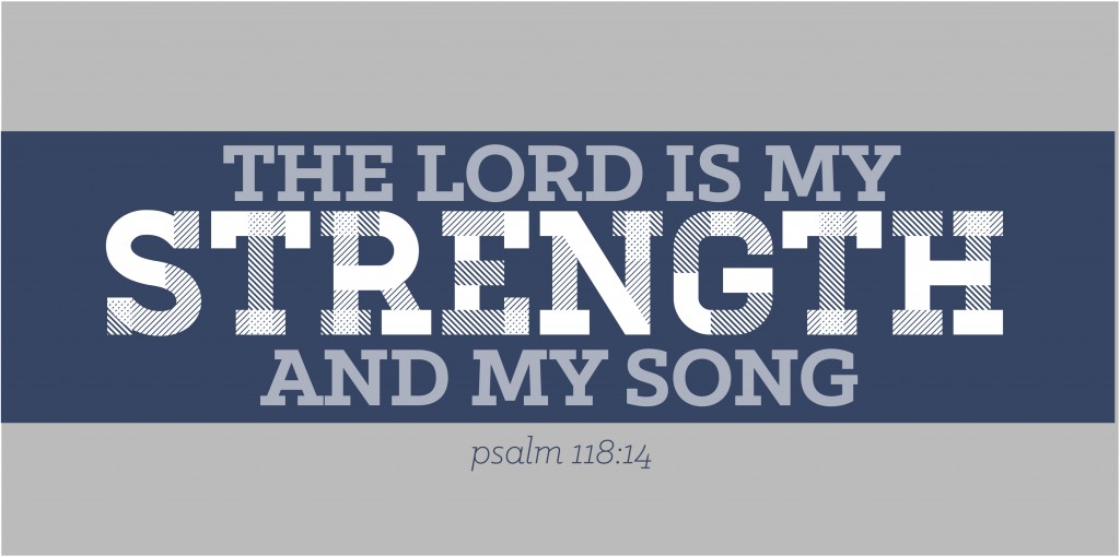
The font I used to create the above graphic is called Canter (available here), and I love the modern, rectangular look.  My eyes always go for old fashioned serifs, so I thought I'd branch out with something different, and this typeface caught my attention.   It's comes as a family of 6 different fonts, including the striped variation, which is a winner in my book!

And because I couldn't really post something as enticing as "Caramel Pumpkin Swirl Scones" without pointing you in the right direction about where to find some, here's a recipe for Glazed Pumpkin Scones with Caramel Drizzle that I think look dangerously delish.

Happy pumpkin season! Caitlin

(PS–this was day 20 of 31 Days of Typography.  To see what other type finds I’ve shared this month, check out the links below!) Day 1: Bolt Day 2: Bloomington Brewing Co Day 3: 58 Day 4: Follow You Day 5: Farm Fresh Produce Day 6: Strength & Song Day 7: Have Faith Day 8: In Deepest Waters Day 9: Potpourri Day 10: Make Something Good Day 11: Let’s Go Cards Day 12: Whitmans Day 13: Gateway Arch Day 14: Beauty Day 15: Life Writing Paper Day 16: Paula Red Day 17: Tattoo Day 18: Popt Corn Day 19: Real Life Type

real life type

Hey hey hey!

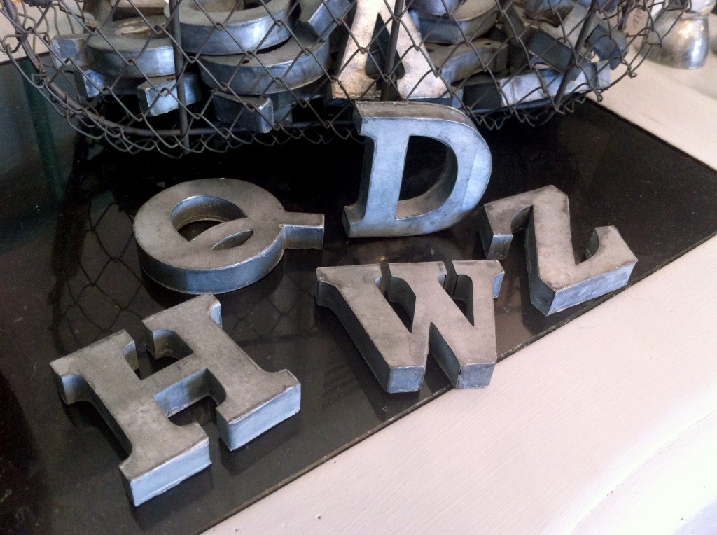
Favorite find of the week right here!  Today I played with these real life type letters for sale in an up-cycled furniture shop.  These beauties are about 4 inches tall, made out of a galvanized metal type material and are endless amounts of fun. Oh, they were so cool and bold and serif-y.  Look at the Z!  And the H! and the D!  How fun would it be to have a giant set and spell out a word of the day in your home each day? Somebody please sign me up for that.

Do you have any cool type finds as art in your home?  Let's hear about it!

Sincerely, Caitlin

(PS–this was day 19 of 31 Days of Typography.  To see what other type finds I’ve shared this month, check out the links below!) Day 1: Bolt Day 2: Bloomington Brewing Co Day 3: 58 Day 4: Follow You Day 5: Farm Fresh Produce Day 6: Strength & Song Day 7: Have Faith Day 8: In Deepest Waters Day 9: Potpourri Day 10: Make Something Good Day 11: Let's Go Cards Day 12: Whitmans Day 13: Gateway Arch Day 14: Beauty Day 15: Life Writing Paper Day 16: Paula Red Day 17; Tattoo Day 18: Popt Corn

popt corn

Hello hello!

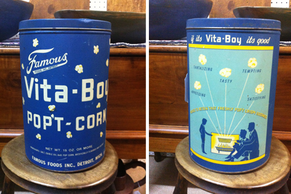
So for Day 18 of 31 Days of Typography, I'd thought I'd share a little antique find, because it's no secret I have a soft spot for vintage type.  How presh is this Vita Boy Pop't Corn canister? I think it's the word "pop't" that's really making me love it so very much.  Put that with the square typography, and there's a lot of retro love happening here.  I also had to share the back of the can, just because the illustration of the family roasting "tantalizing, tempting" popcorn over the fire is so heart-warming.  Making popcorn was much more of an experience a couple of decades ago, wasn't it?

Happy weekend! Caitlin Day 1: Bolt Day 2: Bloomington Brewing Co Day 3: 58 Day 4: Follow You Day 5: Farm Fresh Produce Day 6: Strength & Song Day 7: Have Faith Day 8: In Deepest Waters Day 9: Potpourri Day 10: Make Something Good Day 11: Let's Go Cards Day 12: Whitmans Day 13: Gateway Arch Day 14: Beauty Day 15: Life Writing Paper Day 16: Paula Red Day 17; Tattoo

tattoo

Hey friends!

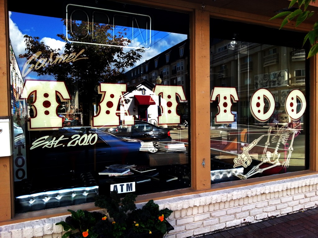
I'm so excited about my new tattoo....post for 31 Days of Typography! Yup, there's no way on earth I'd be brave enough to actually get a tattoo, BUT I do appreciate a good type, like this one I spotted around town.  It's just plain big and funky.  It also has that saloon-y vibe, and while I didn't actually go into this tattoo parlor, nor have I ever entered a tattoo parlor for that matter, I would imagine this font sets the tone for a fine establishment of permanent body inking.  If it doesn't, there's always the friendly skeleton inviting you inside.

Who's got a tattoo in a sweet font?!  I know someone has to have one...

xo, Caitlin

Day 1: Bolt Day 2: Bloomington Brewing Co Day 3: 58 Day 4: Follow You Day 5: Farm Fresh Produce Day 6: Strength & Song Day 7: Have Faith Day 8: In Deepest Waters Day 9: Potpourri Day 10: Make Something Good Day 11: Let's Go Cards Day 12: Whitmans Day 13: Gateway Arch Day 14: Beauty Day 15: Life Writing Paper Day 16: Paula Red 


paula red

Dear Friends,

Fall is finding its way to me, bringing darker evenings, cooler mornings and pumpkin-flavored everythings.   To really dive into the season, my husband and I recently headed out to a local orchard to stock up on a couple of different apple types, and we were pretty successful.  And by that I mean we brought home more than we needed to, but those apples were dying to come home with us, and I just couldn't say no.

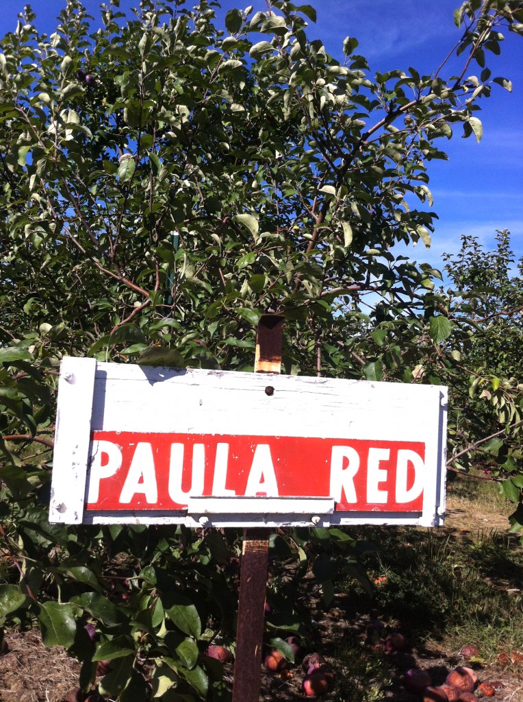
One of my favorite parts of our outing was spotting these signs.  If there was a sign at the end of the row, you knew the trees behind it were ready for pickin' and what type they were.  Isn't the blocky, negative-space type on the red sign awesome?  I sure thought so.   I kinda wanted to bring  the sign home with me to hang in my kitchen, but left it there for the other apple pickers instead.

How's your fall?  Are you really feeling it yet? xo, Caitlin

(PS–this was day 16 of 31 Days of Typography.  To see what other type finds I’ve shared this month, check out the links below!) Day 1: Bolt Day 2: Bloomington Brewing Co Day 3: 58 Day 4: Follow You Day 5: Farm Fresh Produce Day 6: Strength & Song Day 7: Have Faith Day 8: In Deepest Waters Day 9: Potpourri Day 10: Make Something Good Day 11: Let's Go Cards Day 12: Whitmans Day 13: Gateway Arch Day 14: Beauty Day 15: Life Writing Paper

life writing paper

Hey friends!

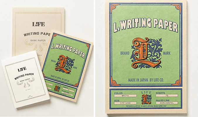
For Day 15 of 31 Days of Typography, I wanted to share this fun find---old school notepads courtesty of Anthro! Can we take a second and just give that "L" the love it deserves?  Mmmmm, yes.

I'm not sure about you, but just looking at the notepads makes me want to start sketching right this moment. Especially, really intricate, flourishy alphabets like the L on the cover. I'm going to play around with that and let you know what I come up with, and you totally should too!  And please show me what your alphabet doodles---Instagram is awesome for sharing sketches!

Peace, love and lettering, Caitlin Day 1: Bolt Day 2: Bloomington Brewing Co Day 3: 58 Day 4: Follow You Day 5: Farm Fresh Produce Day 6: Strength & Song Day 7: Have Faith Day 8: In Deepest Waters Day 9: Potpourri Day 10: Make Something Good Day 11: Let's Go Cards Day 12: Whitmans Day 13: Gateway Arch Day 14: Beauty

beauty

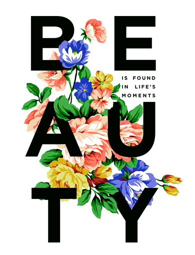
Hello hello! Today's typography find belongs to Sevenly, an online retailer that gives $7 of each purchase to a weekly charity. (Other designs also available, go check out the site!)   This week's purchases go to To Write Love On Her Arms, a non-profit that helps teens who are battling depression.
I think Sevenly brings a lot of great things to one table:  non-profits, crowd fundraising, social awareness, and cool design work.  By stirring all of this together, Sevenly is finding a way to share important messages and help organizations that need support from the community.

This shirt design is on my "Things I Would Wear Everyday" list because 1.) the contrast between the delicate flowers and strong, black text is rad and 2.) it comes in a baseball tee.  You gotta love a good baseball tee, right?

Let's find beauty in life's moments,

Caitlin

(PS–this was day 14 of 31 Days of Typography.  To see what other type finds I’ve shared this month, check out the links below!) Day 1: Bolt Day 2: Bloomington Brewing Co Day 3: 58 Day 4: Follow You Day 5: Farm Fresh Produce Day 6: Strength & Song Day 7: Have Faith Day 8: In Deepest Waters Day 9: Potpourri Day 10: Make Something Good Day 11: Let's Go Cards Day 12: Whitmans Day 13: Gateway Arch

gateway arch

Hello friends!

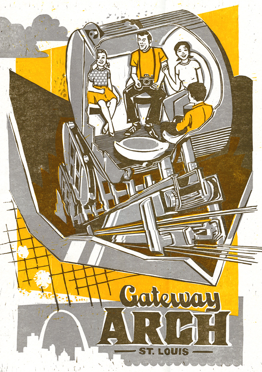
In honor of my brother's wedding in our hometown of St. Louis this weekend, I wanted to share this fantastic print by The Firecracker Press, a graphic design studio and letterpress printshop in STL.  I think I'll always have a soft spot in my heart for the Arch, and love that it welcomes me into the city and bids me farewell on my roadtrips between St.Louis from Indy!

This print is a re-make of a drawing from the 1960s made during the construction phase of the Arch.  I'm really appreciating the "Arch" lettering and fun illustration.  If you haven't been in the spaceships/pods/elevators to check out the view from the top, put it on your itinerary for your next trip to the Lou!

Hope your weekend was the best!

Caitlin

(PS--this was day 13 of 31 Days of Typography.  To see what other type I've shared this month, check out the links below!)Day 1: Bolt Day 2: Bloomington Brewing Co Day 3: 58 Day 4: Follow You Day 5: Farm Fresh Produce Day 6: Strength & Song Day 7: Have Faith Day 8: In Deepest Waters Day 9: Potpourri Day 10: Make Something Good Day 11: Let's Go Cards Day 12: Whitmans

Whitmans

Hey hey hey!

It's Day 12 of 31 Days of Type and can you believe this gem?!  I still need to find the story behind it, but I found this old box for chocolates in my parents' basement and was crazy about it.  My fave section of typography is part that says "Fairhill Chocolates," but the slogan on the front side of the box is just perfect as well: "a wide and tempting variety of delicious flavors."  How could you turn a piece (or box) down?!

And while this box didn't hold 50 year old chocolates, it did contain some serious sweetness---a collection of preciously old handwritten letters and cards.  Birthday cards, holiday cards, thinking of you cards...the occasions were of all sorts, but the old sayings were a hoot.  One in particular that stands out said, "No strings to hold you back on this birthday!" and had Pinocchio-style puppets on the front. So good!

Happy day to you!

Caitlin

Day 1: Bolt Day 2: Bloomington Brewing Co Day 3: 58 Day 4: Follow You Day 5: Farm Fresh Produce Day 6: Strength & Song Day 7: Have Faith Day 8: In Deepest Waters Day 9: Potpourri Day 10: Make Something Good Day 11: Let's Go Cards


let's go cards

Hello hello!

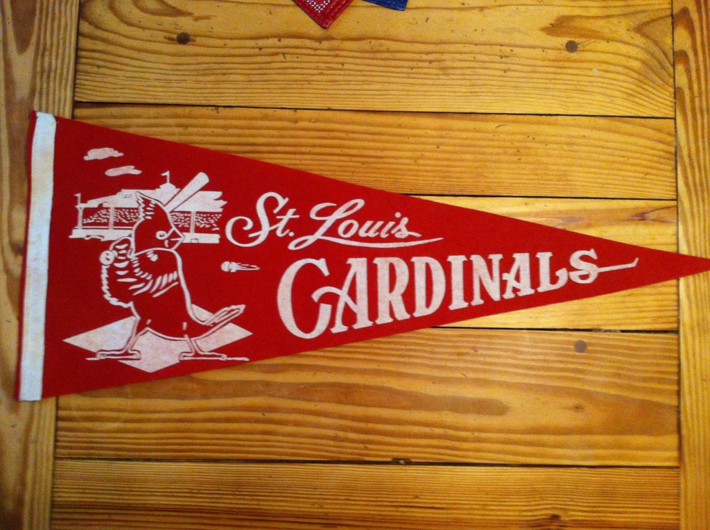
Loving the vintage type on this pennant that we're thinking is from the 60's!  (It's Day 11 of 31 Days of Typography!)

Any other Cardinals fans out there?!  Proud to be from STL and will be cheering these guys on tonight!

xo, Caitlin

Day 1: Bolt Day 2: Bloomington Brewing Co Day 3: 58 Day 4: Follow You Day 5: Farm Fresh Produce Day 6: Strength & Song Day 7: Have Faith Day 8: In Deepest Waters Day 9: Potpourri Day 10: Make Something Good

make something good

Hey friends!

Today's encouraging thought is brought to you by Day 10 of 31 Days of Typography in the fonts Vezus Light and Orniste! I love the grid pattern within Orniste, but I have to be careful not to overuse it in a design because it is so ornate. My suggestion is that if you are going to include it in a graphic, use it sparingly and just where you want something to stand out!  In my opinion, a design would look super busy if a bunch of words were done in Orniste, and the last thing you want to do is detract people from your message. Try pairing it with other thin, san serifs and see what you think.

Go make some good!

xo, Caitlin

Day 1: Bolt Day 2: Bloomington Brewing Co Day 3: 58 Day 4: Follow You Day 5: Farm Fresh Produce Day 6: Strength & Song Day 7: Have Faith Day 8: In Deepest Waters Day 9: Potpourri

influence re-cap

Dear Friends,

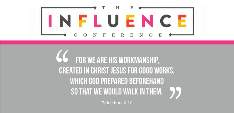
It's hard to believe it's been almost 2 weeks since Influence Conference and I'm just now sitting down to re-cap it. I think it has taken me this long to process the experience because it felt like one big whirlwind of goodness. My brain is still digesting some of things we learned and talked about, but I'm here and excited to share my favorite parts.

First of all, the ladies. The ladies at Influence were oh so wonderful. I felt nerves creeping in as I got ready for Influence...and while I knew that was semi-normal, it didn't stop me from worrying about things like, "What if I don't make one friend the entire weekend?!" or  even worse, "What if my clothes aren't up to standard cuteness?!" You know, all the irrational things we tend to think before we do something a little out of our everyday comfort zone. BUT, as soon as I got there, there were smiling faces to chat with who 1.) Were more than happy to make new friends and 2.) Cared more about why I was there than my outfit. Praise the Lord!

This year I was so excited to participate in the Sashes Market, which was fun on about 100 different levels. It gave me a community of ladies from the very start who are in similar boats of life as me because they were all running handmade businesses. It was GREAT to be able to talk with so many smart, creative, loving business ladies and to admire all their beautiful work.

And then there were the speakers. The truth-spilling, Gospel-bringing, joy-bearing speakers who inspired us to dig deeper in life. We talked about not fearing our gifts and trusting God's plan to use them with Hayley Morgan. We talked about using our hearts and fullest potential to make things happen with Lara Casey. We talked being made for community and why writing/creating  is important with Shauna Niequist. We talked about how and why God created women and what for with Jessi Connolly. We talked about how to pursue dreams given to us by God and what we can do to make more time for them with Jeff Goins. We talked about finding writing voices, sharing our stories and using social media with Kate Bryan. Each session was unique and poignant, and I'm sure many of the words spoken will stick with me for a long, long time.

Other favorite moments of the weekend include: getting to know some pretty big sweethearts over meals, soaking up business tips from the incredibly talented Rebecca Stewart of Better Life Bags during a Handmade Business Workshop, meeting with some of the fantastic organizers and writers of She Reads Truth and singing along all the other attendees as Reeve Coombs and Christopher Kincaid led us in an awesome worship session.

If I had to summarize the conference in one word, it would be "full." Full of Jesus. Full of encouraging women. Full of inspiration and challenges to take home and spur us on.

The influence we have on each other is real and beautiful. Let's use it to love and encourage each other.

xo, Caitlin


potpourri

Well hey!

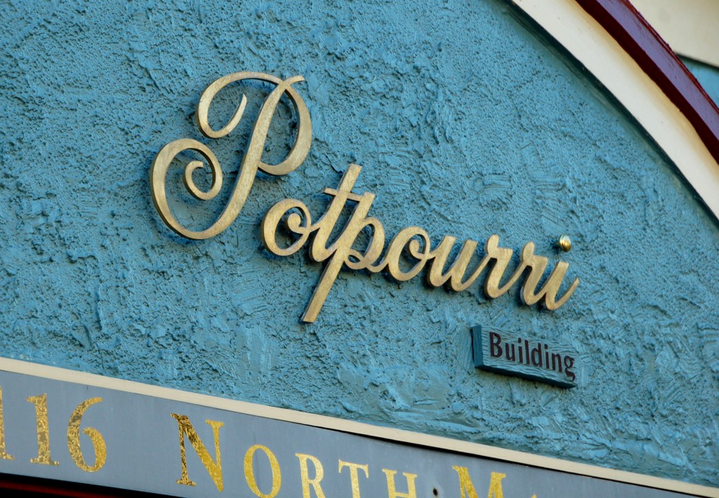
Day 9 of 31 Days of Typography coming at ya right now! Take a peek at the script I spotted on this building. Things I like about this photo in general include:

  • the flourishy script! You know I love me some flourishy script.
  • the gold lettering on the strong blue building = right up my alley
  • the fact that the building is called "Potpourri Building."  You want to smell it, don't you?!

Have you been keeping your eyes open for stellar fonts? Any great finds?

xo! Caitlin

Day 1: Bolt Day 2: Bloomington Brewing Co Day 3: 58 Day 4: Follow You Day 5: Farm Fresh Produce Day 6: Strength & Song Day 7: Have Faith Day 8: In Deepest Waters

in deepest waters

Hey there!

Just checking in for Day 8 of 31 Days of Typography to share some sweet fonts and another great tune!  Today you are getting quite a deal, if I do say so myself.  It's basically a 3-for-1 special.  2 fonts + 1 song that you should totally check out if you haven't already!

The lovely script  is Grand Hotel, and the san-serif one is Antonio.  I'm a big fan of contrast when pairing fonts, so I thought the loopy script and strong, tall caps would make a statement together.  What do you think?

And in regards to the song, go check out Oceans by Hillsong United when you get a chance.  We sang this one during an awesome group worship session at Influence Conference, and it has been in my head ever since.

All the best! Caitlin

Day 1: Bolt Day 2: Bloomington Brewing Co Day 3: 58 Day 4: Follow You Day 5: Farm Fresh Produce Day 6: Strength & Song Day 7: Have Faith 

have faith

Hey there!

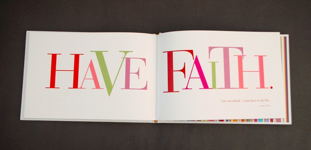
Here's just a little something from a book my sister gave me awhile ago called "Live Good" that is filled to the brim with encouraging phrases and quotes.  I love the colorful, over-sized, serif-y text and had to share it for Day 7 of my 31 Days of Typography!

What's also awesome on these pages is the quote that is blurry in this pic (sorry about that!), but important nonetheless. If you squint really hard, you can see that the quote is by Joan of Arc and reads: "I am not afraid...I was born to do this." Wham bam, how bold is that?  For me, this was an awesome reminder that God gives each of us special, awesome, wonderful things that we were born to do.  Some people are born to sing, some are born to cook, some to teach.  Regardless of what those things are, I think He wants us to have this Joan of Arc attitude.  I think he wants us to be aware that our specific qualities were given to us for a reason, and we are supposed to use them in love to glorify Him right on back.  What do you think?

Let's all have faith in the good we were born to do.

xo, Caitlin

Day 1: Bolt Day 2: Bloomington Brewing Co Day 3: 58 Day 4: Follow You Day 5: Farm Fresh Produce Day 6: Strength & Song

farm fresh produce

Hello hello!

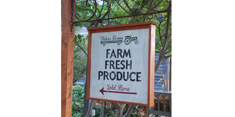
In honor of all the farmers bringing pumpkins, squash, apples and corn to farmer's markets across America, I'm bringing you this typography find of the day!  It's Day 5 of 31 Days of Typography, and I'm so excited about this sign that I spotted earlier this week. The whole look is right up my alley...old, wooden, distressed from usage. The bold caps/old school script combo are simple, but great together because they don't compete. The sign feels warm and inviting, which goes right along with the family business-vibe. And who doesn't love a logo involving a tractor? Automatic "rustic" points, for including the vintage tractor image, right?!

On a side note, I think it's about time I picked up some pumpkins to get a little fall decor going.  I'm kinda loving the white pumpkin look, what do you think?

Happy weekending! Caitlin

Day 1: Bolt Day 2: Bloomington Brewing Co Day 3: 58 Day 4: Follow You

follow you

Hello hello!!

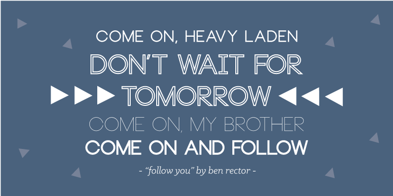
Today I'm celebrating Friday and Day 4 of 31 Days of Typography by sharing a fave font and a song I'm really loving right now.  As pictured above, the font "Neou" is a ton of fun to use and is a free download here!  I'm crazy about how many different looks you can get from one typeface.  If I had to choose a favorite style from the above, I'd have to go with the outlined variation, but the thin style is just a short step behind in my book.

And now let's talk about "Follow You" by the super-great Ben Rector.  If you haven't heard it yet, go ahead and do yourself a favor and click this.  And then prepare yourself to hit that replay button about 12 times.  I'm a big fan of all Ben's music in general, but this one is at the very top of my list right now.  I've been working on a ton of escort and place cards for October weddings this week, and you better believe this song is being played in the background while I work.

Hope your Friday is da bomb and the rest of the weekend is even better!

xo, Caitlin

Day 1: Bolt Day 2: Bloomington Brewing Co Day 3: 58

58

Hey there!

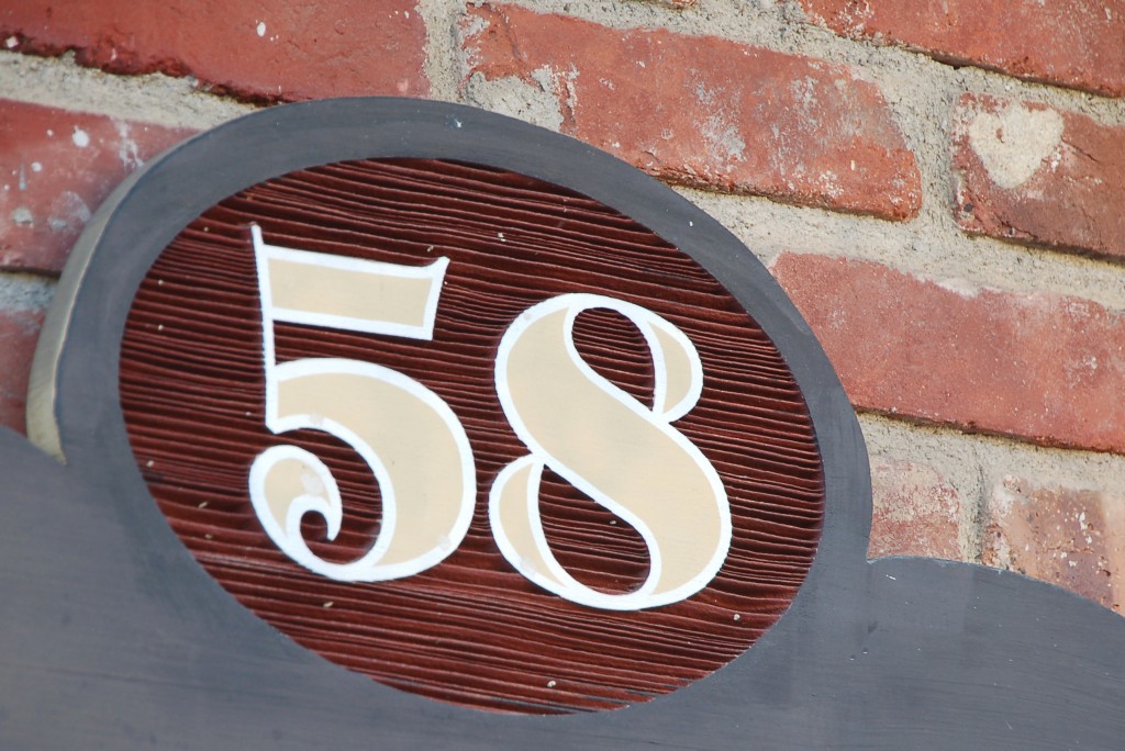
It's Day 3 of 31 Days of typography, and we're going strong.  And by strong  I mean bold, like this numeral above.  Can you believe this lovely set of type that jumped out at me from a sign board?  Of all numbers, 58! If you subtract 5 from the 8, you get 3...a sign that this was meant to be, right?  Ok, maybe a stretch, but I did love these funky numbers that serve as an address and a directory board for shops nearby. The curl at the bottom of the five, the thick, sweeping 8...yes!  I'm actually not sure if I like the shape of the 8 or the teardrop shapes in the 8's negative space better. This numeral knows it's cool and it should, because it's got style to prove it.

Hope your day is filled with fun details like this guy.  Keep your eyes open and let me know what you find!

Peace and numbers, Caitlin 

Day 1: Bolt Day 2: Bloomington Brewing Co

bloomington brewing co

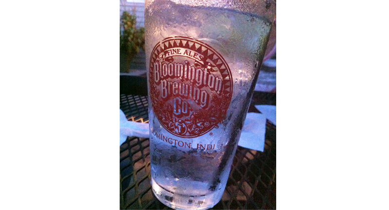
Hey there! How great is this glass?  Kinda one of those that you want to accidentally put in your purse and take home with you, right?  While I did not steal this glass from the restaurant we met some family at tonight, I did snap a picture of it so it could be honored properly in during this 31 Days of Typography!

The whole logo is so classic, dare I say even a little royal looking, and I love it.  Maybe it's my Bloomington bias that drew me to this glass, but I'm pretty sure Hoosiers and non-Hoosiers alike can dig the diagonals in this typography. It's old school and reminds me of the lettering chiseled into all the limestone at IU, straight out of 1884.

Have you found any type that's called out to you recently?!  Share below--I'd love to hear!

xo, Caitlin


Day 1: Bolt