summer summer

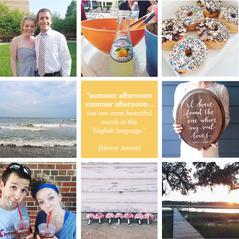
{a collection of some of my fave instagram pics  from this summer}

Dear friends,

I don't know about you, but for me, this summer is just whirling by. You can ask my husband---I'm in "holy moly, it's August!" mode, which means I'm saying things like, "We need to get ice cream and jump in the pool and do every summer thing right now because it's going to be cold soon!" And then he reminds me that we live in North Carolina now and it will still be warm for a little while, so we're going to be ok. Phew! Too many fun things, too little time, right?

But still, I'm a summer person. I was made for summer. I love the hot and the vacations and the sun not setting til well after 8pm. I could eat watermelon, peaches and blueberries for all my meals and I'd be one happy camper. It's my very favorite time of the year, and these months have been especially fun since they've been highlighted with weddings, vistors, travels, and the greatest little sushi place we discovered within walking distance! Can I get an amen?!

So lately I've just been trying to soak them up one day at a time and make the most of the sunshine and lemonade weather. The great news is that we've still got a lot of fun to look forward to this month. Our 2 year (what?!) anniversary is just around the corner and we're headed to Charleston for some more Southern adventures, and I'm so excited I am basically already packed. Side note: if you have any recs for things to see/do/eat in while we're there, please share below! I'd love to hear!

Hope you all are summer lovin'! xo, Caitlin

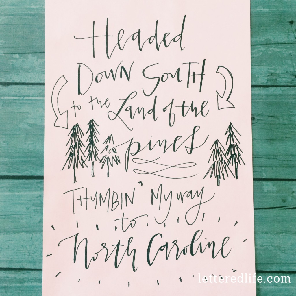
the one where i live in north carolina

Dear friends,

Well hiii!  I feel like I should write you all postcards saying "Greetings from Charlotte! We made it!" because guess what?  We moved to North Carolina this weekend, just in time for spring....which starts tomorrow if you haven't been counting down!  So just pretend like this is your postcard, and on the front there is a picture of  me waving at you among the blooming dogwood trees with the caption "Hey, y'all!"...because I'm pretty much a southern lady now.

The transition from Indy to Charlotte was kind of a zany one, but I wouldn't have had it any other way.  We packed our days with family visits, friend hang outs, restaurants that were still on our bucket list, and even spent the weekend at a retreat with 50+ high schoolers from our church on our way out of town.  From there, we were Charlotte-bound, which meant driving through snow, sleet, rain and fog as we wound our way through the Smokies and towards Charlotte.  Charlotte ended up being SO thrilled to have us, she poured down even more sleet and rain as we unloaded the truck, which was hysterical and 100% not ok all at the same time.  We laughed (and I nearly cried) carrying our stuff through all the precipitation, but we capped off the move by celebrating St. Patty's Day with homemade reubens, which {almost} made up for all the freezingness.

So now we're here, getting all settled and learning our new 'hood.  The screws to our kitchen table have gone MIA and I just found the silverware in a laptop bag---but that's part of the adventure, right?!  Sending you lots of North Carolina love!

Sincerely, Caitlin

gateway arch

Hello friends!

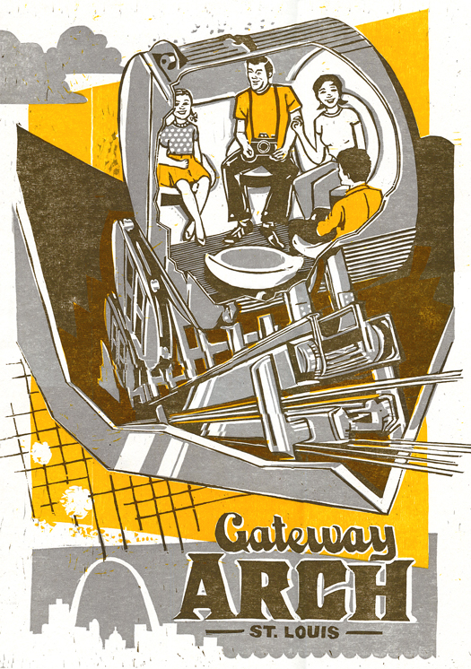
In honor of my brother's wedding in our hometown of St. Louis this weekend, I wanted to share this fantastic print by The Firecracker Press, a graphic design studio and letterpress printshop in STL.  I think I'll always have a soft spot in my heart for the Arch, and love that it welcomes me into the city and bids me farewell on my roadtrips between St.Louis from Indy!

This print is a re-make of a drawing from the 1960s made during the construction phase of the Arch.  I'm really appreciating the "Arch" lettering and fun illustration.  If you haven't been in the spaceships/pods/elevators to check out the view from the top, put it on your itinerary for your next trip to the Lou!

Hope your weekend was the best!

Caitlin

(PS--this was day 13 of 31 Days of Typography.  To see what other type I've shared this month, check out the links below!)Day 1: Bolt Day 2: Bloomington Brewing Co Day 3: 58 Day 4: Follow You Day 5: Farm Fresh Produce Day 6: Strength & Song Day 7: Have Faith Day 8: In Deepest Waters Day 9: Potpourri Day 10: Make Something Good Day 11: Let's Go Cards Day 12: Whitmans

Whitmans

Hey hey hey!

It's Day 12 of 31 Days of Type and can you believe this gem?!  I still need to find the story behind it, but I found this old box for chocolates in my parents' basement and was crazy about it.  My fave section of typography is part that says "Fairhill Chocolates," but the slogan on the front side of the box is just perfect as well: "a wide and tempting variety of delicious flavors."  How could you turn a piece (or box) down?!

And while this box didn't hold 50 year old chocolates, it did contain some serious sweetness---a collection of preciously old handwritten letters and cards.  Birthday cards, holiday cards, thinking of you cards...the occasions were of all sorts, but the old sayings were a hoot.  One in particular that stands out said, "No strings to hold you back on this birthday!" and had Pinocchio-style puppets on the front. So good!

Happy day to you!

Caitlin

Day 1: Bolt Day 2: Bloomington Brewing Co Day 3: 58 Day 4: Follow You Day 5: Farm Fresh Produce Day 6: Strength & Song Day 7: Have Faith Day 8: In Deepest Waters Day 9: Potpourri Day 10: Make Something Good Day 11: Let's Go Cards


let's go cards

Hello hello!

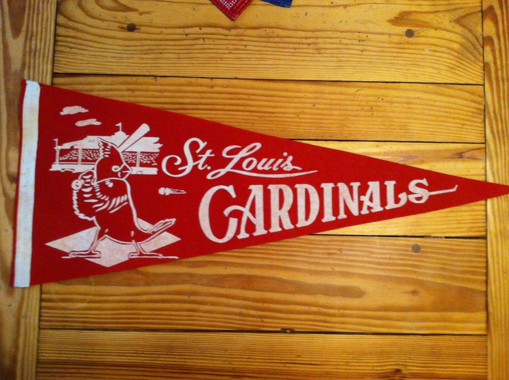
Loving the vintage type on this pennant that we're thinking is from the 60's!  (It's Day 11 of 31 Days of Typography!)

Any other Cardinals fans out there?!  Proud to be from STL and will be cheering these guys on tonight!

xo, Caitlin

Day 1: Bolt Day 2: Bloomington Brewing Co Day 3: 58 Day 4: Follow You Day 5: Farm Fresh Produce Day 6: Strength & Song Day 7: Have Faith Day 8: In Deepest Waters Day 9: Potpourri Day 10: Make Something Good

make something good

Hey friends!

Today's encouraging thought is brought to you by Day 10 of 31 Days of Typography in the fonts Vezus Light and Orniste! I love the grid pattern within Orniste, but I have to be careful not to overuse it in a design because it is so ornate. My suggestion is that if you are going to include it in a graphic, use it sparingly and just where you want something to stand out!  In my opinion, a design would look super busy if a bunch of words were done in Orniste, and the last thing you want to do is detract people from your message. Try pairing it with other thin, san serifs and see what you think.

Go make some good!

xo, Caitlin

Day 1: Bolt Day 2: Bloomington Brewing Co Day 3: 58 Day 4: Follow You Day 5: Farm Fresh Produce Day 6: Strength & Song Day 7: Have Faith Day 8: In Deepest Waters Day 9: Potpourri

potpourri

Well hey!

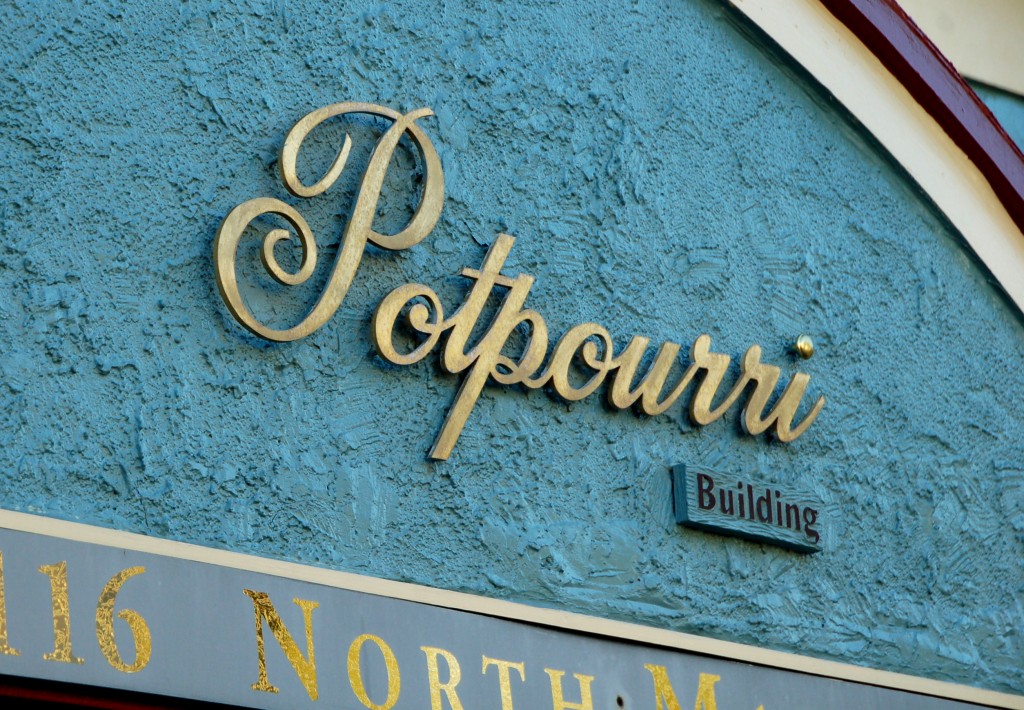
Day 9 of 31 Days of Typography coming at ya right now! Take a peek at the script I spotted on this building. Things I like about this photo in general include:

  • the flourishy script! You know I love me some flourishy script.
  • the gold lettering on the strong blue building = right up my alley
  • the fact that the building is called "Potpourri Building."  You want to smell it, don't you?!

Have you been keeping your eyes open for stellar fonts? Any great finds?

xo! Caitlin

Day 1: Bolt Day 2: Bloomington Brewing Co Day 3: 58 Day 4: Follow You Day 5: Farm Fresh Produce Day 6: Strength & Song Day 7: Have Faith Day 8: In Deepest Waters

in deepest waters

Hey there!

Just checking in for Day 8 of 31 Days of Typography to share some sweet fonts and another great tune!  Today you are getting quite a deal, if I do say so myself.  It's basically a 3-for-1 special.  2 fonts + 1 song that you should totally check out if you haven't already!

The lovely script  is Grand Hotel, and the san-serif one is Antonio.  I'm a big fan of contrast when pairing fonts, so I thought the loopy script and strong, tall caps would make a statement together.  What do you think?

And in regards to the song, go check out Oceans by Hillsong United when you get a chance.  We sang this one during an awesome group worship session at Influence Conference, and it has been in my head ever since.

All the best! Caitlin

Day 1: Bolt Day 2: Bloomington Brewing Co Day 3: 58 Day 4: Follow You Day 5: Farm Fresh Produce Day 6: Strength & Song Day 7: Have Faith 

have faith

Hey there!

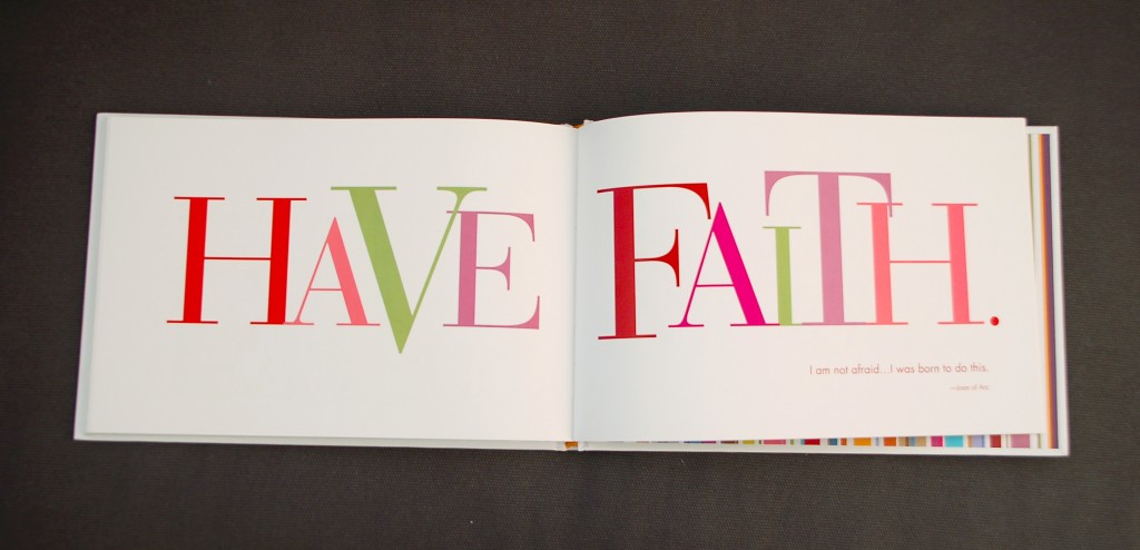
Here's just a little something from a book my sister gave me awhile ago called "Live Good" that is filled to the brim with encouraging phrases and quotes.  I love the colorful, over-sized, serif-y text and had to share it for Day 7 of my 31 Days of Typography!

What's also awesome on these pages is the quote that is blurry in this pic (sorry about that!), but important nonetheless. If you squint really hard, you can see that the quote is by Joan of Arc and reads: "I am not afraid...I was born to do this." Wham bam, how bold is that?  For me, this was an awesome reminder that God gives each of us special, awesome, wonderful things that we were born to do.  Some people are born to sing, some are born to cook, some to teach.  Regardless of what those things are, I think He wants us to have this Joan of Arc attitude.  I think he wants us to be aware that our specific qualities were given to us for a reason, and we are supposed to use them in love to glorify Him right on back.  What do you think?

Let's all have faith in the good we were born to do.

xo, Caitlin

Day 1: Bolt Day 2: Bloomington Brewing Co Day 3: 58 Day 4: Follow You Day 5: Farm Fresh Produce Day 6: Strength & Song

farm fresh produce

Hello hello!

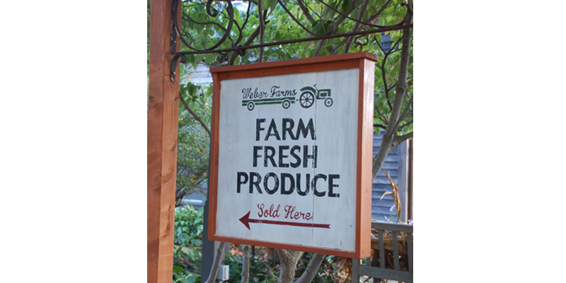
In honor of all the farmers bringing pumpkins, squash, apples and corn to farmer's markets across America, I'm bringing you this typography find of the day!  It's Day 5 of 31 Days of Typography, and I'm so excited about this sign that I spotted earlier this week. The whole look is right up my alley...old, wooden, distressed from usage. The bold caps/old school script combo are simple, but great together because they don't compete. The sign feels warm and inviting, which goes right along with the family business-vibe. And who doesn't love a logo involving a tractor? Automatic "rustic" points, for including the vintage tractor image, right?!

On a side note, I think it's about time I picked up some pumpkins to get a little fall decor going.  I'm kinda loving the white pumpkin look, what do you think?

Happy weekending! Caitlin

Day 1: Bolt Day 2: Bloomington Brewing Co Day 3: 58 Day 4: Follow You

follow you

Hello hello!!

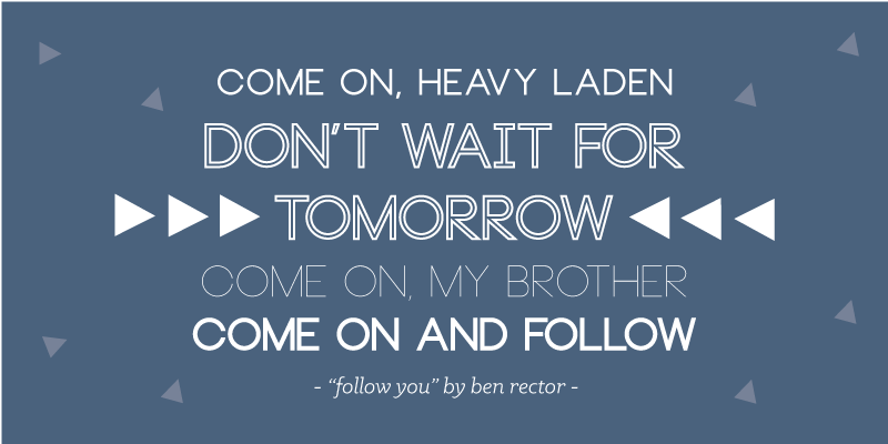
Today I'm celebrating Friday and Day 4 of 31 Days of Typography by sharing a fave font and a song I'm really loving right now.  As pictured above, the font "Neou" is a ton of fun to use and is a free download here!  I'm crazy about how many different looks you can get from one typeface.  If I had to choose a favorite style from the above, I'd have to go with the outlined variation, but the thin style is just a short step behind in my book.

And now let's talk about "Follow You" by the super-great Ben Rector.  If you haven't heard it yet, go ahead and do yourself a favor and click this.  And then prepare yourself to hit that replay button about 12 times.  I'm a big fan of all Ben's music in general, but this one is at the very top of my list right now.  I've been working on a ton of escort and place cards for October weddings this week, and you better believe this song is being played in the background while I work.

Hope your Friday is da bomb and the rest of the weekend is even better!

xo, Caitlin

Day 1: Bolt Day 2: Bloomington Brewing Co Day 3: 58

58

Hey there!

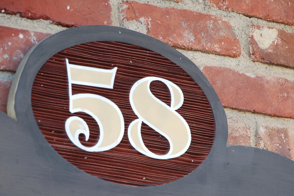
It's Day 3 of 31 Days of typography, and we're going strong.  And by strong  I mean bold, like this numeral above.  Can you believe this lovely set of type that jumped out at me from a sign board?  Of all numbers, 58! If you subtract 5 from the 8, you get 3...a sign that this was meant to be, right?  Ok, maybe a stretch, but I did love these funky numbers that serve as an address and a directory board for shops nearby. The curl at the bottom of the five, the thick, sweeping 8...yes!  I'm actually not sure if I like the shape of the 8 or the teardrop shapes in the 8's negative space better. This numeral knows it's cool and it should, because it's got style to prove it.

Hope your day is filled with fun details like this guy.  Keep your eyes open and let me know what you find!

Peace and numbers, Caitlin 

Day 1: Bolt Day 2: Bloomington Brewing Co

bloomington brewing co

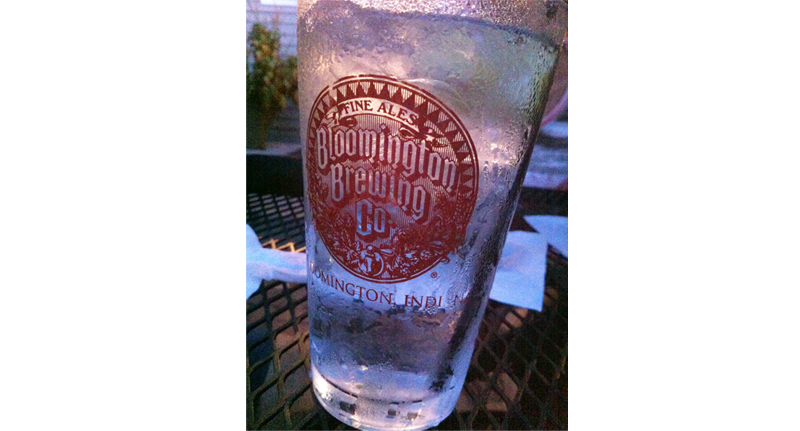
Hey there! How great is this glass?  Kinda one of those that you want to accidentally put in your purse and take home with you, right?  While I did not steal this glass from the restaurant we met some family at tonight, I did snap a picture of it so it could be honored properly in during this 31 Days of Typography!

The whole logo is so classic, dare I say even a little royal looking, and I love it.  Maybe it's my Bloomington bias that drew me to this glass, but I'm pretty sure Hoosiers and non-Hoosiers alike can dig the diagonals in this typography. It's old school and reminds me of the lettering chiseled into all the limestone at IU, straight out of 1884.

Have you found any type that's called out to you recently?!  Share below--I'd love to hear!

xo, Caitlin


Day 1: Bolt


bolt

Hi there friends!

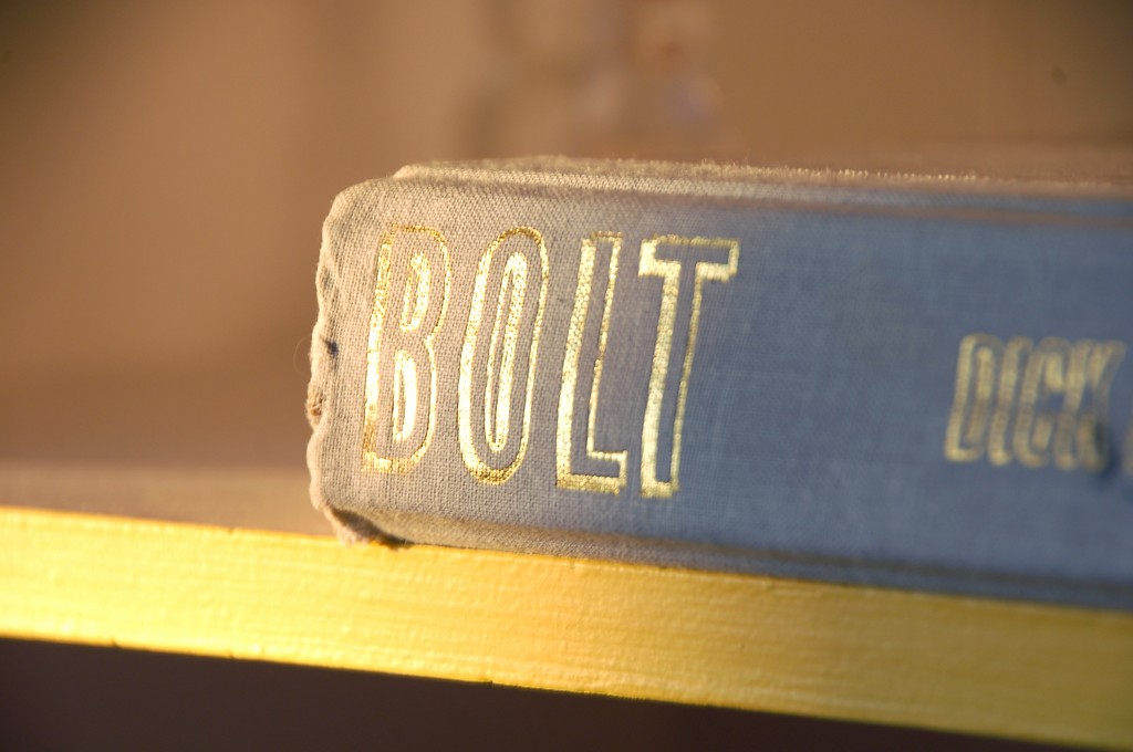
I'm starting off my 31 Days of Typography with this glinting example discovered in the world around me, courtesy of my local library.  Today I popped in to the library with my husband so we could stock up on some reads for October, and on the way in, I stopped by the little shelf that holds some books that are free with a donation to the library.  You just never know what will be on those shelves, and today brought this gem of a book, with its shining, shimmering spine.  It sat among some books about economics and fighter planes, just waiting for me to come discover it's fontastic spine.  (Oh yes I did.)

I instantly knew this book needed a spot on our own bookcase, where we can admire the title's gold dimension and lean structure.   The type is strong and a little flashy, which I think meshes with the word "bolt" so well.  What a beaut!

Welp, I hate to run, but I do have to bolt, so best wishes for a fantastic day.  (Seriously on a roll here.)

xo, Caitlin


31 Days of Typography

Dear Friends,

Here we go, here we go!

Tomorrow kicks off a new month and with it I'll be jumping into a new project---31 Days of Typography.  The tagline in my head for this bad boy is "Sharing and Pairing Letters That I Love."  Or you can join my husband in simply calling the whole thing "Come Thou Font." Whatever works, just get ready for a font-filled time.

I'm joining up with The Nester and bunches of others who will spend October delving into topics of their choice and posting about it each day.  Typography jumped out at me as something to explore because...

1.) You know I love me some letters and 2.) I know typography is around me.  I want to notice these special little details in everyday life and 3.) I'd like to practice pairing with new type finds and combos

Sounds like a party, right?  I'll be linking each day to this post, so this will be home base for all that's to come related to the 31 Days of Typography.

Let's do this thang! Caitlin

Day 1: Bolt Day 2: Bloomington Brewing Co Day 3: 58 Day 4: Follow You Day 5: Farm Fresh Produce Day 6: Strength & Song Day 7: Have Faith Day 8: In Deepest Waters Day 9: Potpourri Day 10: Make Something Good Day 11: Let's Go Cards Day 12: Whitmans Day 13: Gateway Arch Day 14: Beauty Day 15: Life Writing Paper Day 16: Paula Red Day 17: Tattoo Day 18: Popt Corn Day 19: Real Life Type Day 20: Caramel Pumpkin Swirl Scones Day 21: Honey Day 22: Autumn Day 23: Between the Pages Day 24: Washingtonian Best Breakfasts Day 25: Lakeview Day 26: Life Is the Art of Drawing Day 27: Flourish Day 28: Anchor of Hope Day 29: Coconut Banana Cream Day 30: Play Day 31: October Eves

Seizing the Day: Goal Check-In

Hiya friends!

April check-in time! A little late but better than never!  Here's a look at how March went and how well I stuck to some of my monthly goals...

  • Reading 2 books a month. Yes!  Have you read "Wild: From Lost to Found on the Pacific Crest Trail” by Cheryl Strayed or "The Art of Hearing Heartbeats" by Jan-Philipp Sendker? Both were on my list this month and both I enjoyed!  While they had completely opposite settings (mountainous trail that runs from Mexico to Canada vs.  small town, mid-twentieth-century Burma) they both had themes of finding something that was lost.  The first book told the true story of a woman's adventures on the PCT to find her true self, while the second read more like a fairy tale mystery where the narrator discovers the truth about her father's mysterious past.  Have I enticed you yet?   There's just something about reading a lost and found story that inspires you, right?  I just re-read the Prodigal Son in Luke earlier this week and MAN, how moving is it when we find our way back home to God after straying for a little while? Just a thought! Moving on to...
  • SheReadsTruth. The reflections through Holy Week were such a great way to get in the zone each morning, and made Easter that much sweeter! I started a new plan called Prayer in the Bible last week that will go on a for a few more, so be sure to join along if you're interested! 
  • Blog 3 times a week.  Ay yi yi.  Not so much.  Considering either adjusting this number or making myself make it happen.  Not quite sure what I will do, but next month's posting rate will tell.
  • Go crazy with my Etsy shop.  I haven't added anything new to the shop recently, but I've been doing a lot of custom orders and addressing of wedding envelopes which has kept my plate full!  Making Things Happen was such a great experience and I'm already learning so much about how to align the business to my core, which is a beautiful thing.  I was also introduced to a new printer that may allow me to extend the types of products sold...like this iPhone case  SO FUN!  Hopefully by next month I'll be able to introduce you to a few more offerings.
I'm adding this one to April's goals, so hold me to it!
  • Be outside.  Love the sunshine.  Soak up the new season!

Lots of love,

Caitlin