
 Friends,
31 Days of typography has been real. Thanks for venturing along with me, and thanks for giving me grace when I was behind....although I did stay on top of it for longer than I thought I could! That last week ended up being hard to pull together, but I'm glad I could really sit down and move through the final days, even if it was secretly a little behind. The journey wasn't quite over for me, so I took a few more days to complete it. I hope that was ok with you, and the whole month was a fun one. Hopefully you have found some ideas that you can keep in your back pocket for future type projects. Spending time studying font styles that really stood out to me made me want to spend about a 100000 more hours sketching out new ideas, and I'm thankful for the burst of inspiration.
So hope those October eves treated you well, and cheers to what's to come. The lovely illustration above is one of the many spunky-fun works of Mary Kate McDevitt!
Peace,
Caitlin
P.S. This wraps up 31 Days of Typography. Click here for other typography posts!
 Well hi!
 Hey friends!
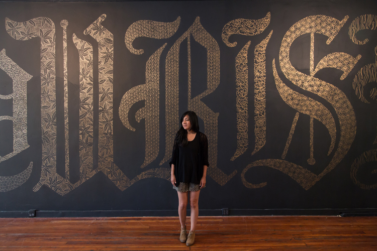 Hey friends,
 Hello hello!
 Hey hey!


 Hey honey!

 Hello hello!

 Hey friends!
 Hello hello!
Today's typography find belongs to
Hello hello!
Today's typography find belongs to